
Stack Overflow
Review queues
Duration: 1-2 years
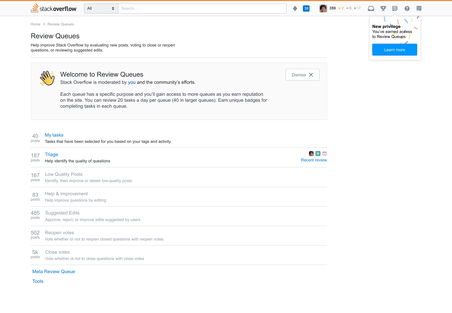
Community moderation is a significant aspect of Stack Overflow and the Stack Exchange sites. One of the ways that the community moderates the site is by using the Review queues, a system of curated posts that users can assist in determining whether posts are beneficial to the site.
Access to Review queues are granted once a user reaches a certain level of reputation and are often used by our most active and dedicated users, the content-curating and moderator communities. Improving these content moderation tools will better support and serve this segment of our user base.
Research
The review queues are complicated. To fully understand the user issues, I had to first learn about the logic behind the queues; how are queues populated and why?
Discovery methods
read existing posts about review queue function
interviewed active reviewers and moderators across the Stack Exchange network
conducted data analysis on current review queue usage
read through multiple outstanding issues raised by our community members
This initial research helped identify issues with the existing review queue system and led to the first iteration of changes. Preliminary designs were then shared in hour-long, 1:1 user tests. Feedback was also more openly solicited in a Meta post.
User experience improvements
Accesible, informative user suspensions
If a user appears to be reviewing without thoughtful consideration, they may find themselves temporarily suspended from reviewing. However, in our research, we discovered that users had no idea that they were suspended.
Users did not receive visible, informative notifications about their suspension. The queues would simply be gone as if it were a bug. This situation unintentionally makes it hard for the user to learn about what they did wrong. Moderators were giving overly long review suspension in hopes that the reviewer just might discover their suspension notice.

Moderator tools: Assigning suspensions
Moderators had been creating user scripts to add more functionality to a rudimentary interface used to assign review suspensions. This lack of functionality and options placed an unfair burden on moderators who sought to improve the quality of reviews through review suspension enforcement.
We upgraded this interface to be more robust, adding the ability to quickly add the offending reviews and templated messages to deliver to the reviewer.

New reviewer onboarding
Information and guidance about how to use the review queues is available, but it can be difficult to find. The instructions are not visible and could be misinterpreted, leading new reviewers to make poor decisions. We are adding multiple means of upfront instruction to better equip reviewers to use their newly earned privilege.
Users will find an onboarding message on the homepage with general information about using the Review Queues. As they enter each new queue, they will be presented with a modal with specific instructions on how to best contribute to that queue.
We worked closely with the community to build consensus on how to review in each queue and how to do so fairly.
You can read more about how we crowd-sourced feedback on Help center documentation from our community in my blog post.
UI changes
Significant visual changes were made to the queues. These updates were made based on issues raised by users in the initial research.
Before –

Now –
Actions menu - We removed the actions buttons for a menu-style component. Selecting an action now requires a bit of pause. Instructions are now always visible and associated with each action.
More context - Users can now toggle between the review task and the necessary context on the task page to assist in making educated decisions on a task.
Vote controls and follow feature - Users expressed that being able to vote directly on all tasks as well as the option to follow posts and receive updates on changes would help in the reviewing process.
Filter button - Highlighting this feature (where it’s available) with a button and replacing the easily missed text-link.

Next steps
Design changes went live beginning in July 2020 and will continue to be released in phases into 2021. In collaboration with the Architecture team, we now have a unique opportunity to rebuild review queues from the bottom-up. We are taking a holistic look at the effectiveness of each queue and continuing to work closely with the community.
Ask a question
Duration: 6 months
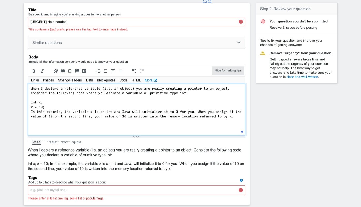
In March 2019, Stack Overflow launched the Ask Question Wizard. It was introduced to assist new users in drafting their questions and to regulate quality content on the site. This was the first significant change made to the question-asking experience since the inception of Stack Overflow. Although created with good intentions, the Wizard was segmented exclusively to new users and was divergent from the overall user experience. Asking a question on Stack Overflow remained a daunting task and led to potential negative interactions and friction between question-askers and question-answerers.
The Public Product team took a step back to look at the problem more holistically to identify new opportunities and introduce a more inclusive solution. After months of research and design, the project concluded with a larger redesign of the question-asking editor and deprecation of the Wizard.
Read my research update on the Stack Overflow blog.

Research
This project kicked off with extensive design exploration. When problems are vast and solutions are not obvious, we begin with research.
This research project used multiple methods of collecting both qualitative and quantitative data. We conducted data analysis on the behavior and characteristics of our current user base, dove deep into the performance of the Ask Question Wizard, gathered insights from 1:1 interviews with low-reputation lurkers to high-reputation veterans, and studied other sites in UX teardowns.
1. What is the current state?
2. How are people solving their coding issues outside of Stack Overflow?
3. How does our Q&A experience diverge from people’s expectations?
4. What can we learn from similar “post content” → “get feedback” flows?
Design
The Ask Question Wizard didn’t address the issue that posting a question on Stack Overflow was intimidating no matter a person’s programming experience or time on the site. Users were expected to graduate from the guided mode to the traditional mode, but the differing UI designs proved to cause possible difficulty in making the transition.

Based on the research, I was able to design a question-asking flow that unifies the traditional and guided modes and helps users of all reputation and experience levels.
We initially released this exclusively to Stack Overflow. In February 2019, we expanded this update to Stack Overflow’s international sites and the Stack Exchange network.
Welcome modal

Users agreed that writing a good programming question was a challenging, learned skill that takes instruction and practice. The Wizard was successful in helping new users write higher quality questions, but this was guidance and information that could be useful to all our users.
When asking a question, users were originally given a wall of text with tips and terms to accept before proceeding to the editor. The new design offers upfront guidance and a more approachable design. Users can focus on drafting their question without distraction and are provided instruction all in one space with less need to navigate away from the form.
Two-step drafting
Negative interactions with the community was an expected part of the question-asking experience. Users felt anxious about how the community would receive their question. In part of the user interview, participants were asked to review sample questions from Stack Overflow. Many people noted how certain examples would likely be targets for snide remarks.
All our users should feel confident asking a question on Stack Overflow. To assuage these concerns and mitigate potential vitriol, I created a two step process for submitting a question. The first step allows users to draft their question without distraction. The second review step marks any errors, suggests improvements, and gives the author an opportunity to reread their question before publishing it.
What to expect modal

Once a user posts their first question, they will receive the “What to Expect” modal. Many users were uncertain about what happens after a question is submitted. Additionally, not receiving an answer also caused anxiety. The “What to Expect” modal was introduced into the question-asking workflow so that users could have a better sense of what happens after they post their question. The modal provides information as well as additional guidance to support their post.
Reactions
Stack Overflow for Teams is a space for teammates to ask questions and find answers. The Teams product utilizes the Stack Overflow Q&A layout to create a knowledge base with coworkers and colleagues.
What started as an idea on the Public Platform team for Public Q&A soon became an interesting feature worth testing and providing on the Teams product.
Icons designed by David Longworth

Problem
Stack Overflow users are not allowed to leave comments on a post until they reach at least 15 reputation points. This often leads to users abusing the Answers field and posting non-answers. We collected data on the content of comments across the site and found that although users are discouraged from saying thanks in the comments, it one of the most frequently added sentiments.
Goal
quell the number of non-answer posts
promote helpful, relevant comments
give users a way to share their gratitude
Research & development
Ideation The Community Product team ideated on different solutions worth exploring and converged on Reactions as possible solution.
Quick creation I organized a design team brainstorm activity where product designers and UX researchers from across the organization gathered to work on different ways we could integrate and develop the Reaction feature.
Hallway testing I performed 1:1 interviews with coworkers who are also Stack Overflow users. This was an inexpensive method of user testing to gather quick insights.
Product divergence and iteration We identified different risks and needs between our Public and Private platforms. At this point the Reactions feature was going to be distinctly different than what we would deploy on StackOverflow.com
User Interviews A new design was created solely for Public Q&A. I recruited Stack Overflow users for 1:1 interviews to gather more targeted insight with our main audience.
Iterations


Final design


Reactions for Teams launched in November 2019. Members within a team can use multiple emoticons to express gratitude or amplify their need for help. We launched with an initial set of 4 emoticons with plans to add more.
In addition to multiple reactions, team members will be notified when their posts are receiving reactions as well have access to a modal that shows who reacted with what emoticon.
Public Q&A
A small A/B test was conducted on StackOverflow.com offering users the option to react to answer posts (not questions), with the “thanks” emoji. This test has since ended and future considerations to ship this feature live are on hold.
April Fools'

Stack Overflow’s annual April Fool’s joke.
In cahoots with fellow prankster and developer, Jon Chan, I was able to wreak havoc and override their HTML and CSS for 24 hours.
This was received with mixed reviews across the internet 👍
Use this user script to live in the 90’s forever.